

In anticipation of my next project, I've been experimenting with different ways of handling color. Coloring black-and-white line art is a challenge in digital media. Cartoonists spend a lot of time debating and sharing the best ways to achieve the look they want and have it appear in print as intended.
Of course, one approach is to simply color the original with inks, watercolors, markers, etc., then scan it as a single work of art the same way you would a photograph. The main drawback is that you only get one shot at that; mess up the coloring and you're starting over from scratch. A more subtle drawback is that printed blacks come out much cleaner and blacker if they can be printed by themselves. It's good to keep blacks and colors separate if possible.
Another approach is to scan the line art and then color it digitally with Photoshop or similar software. That's what I did on Mom's Cancer. Once you learn to do that right, it works pretty well. Some artists (not me) are Photoshop masters who can use different techniques and effects to create beautiful work. But unless you're really good (again, not me), I think Photoshopped work has a sterile quality I dislike.
A similar approach is to do the entire project digitally, line art included. Increasing numbers of artists work entirely on the computer, start to finish. Without igniting a heated "Digital/Paper" debate, I'll just say I don't have the equipment to do that and wouldn't want to if I did.
In fact, I feel pretty strongly that I'd like to go the other direction, making my work as hand-crafted as possible. It's more fun and shows more life and personality. Today's experiment was aimed at finding a new way of doing a black-and-white drawing on one piece of paper, watercolor on another piece of paper, and combining them in Photoshop.
Here's my line art: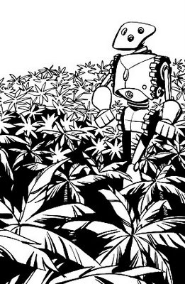
This is india ink on bristol board, about 5.5 x 8.5 inches, done with a brush. To start, I scanned this at a very high resolution (1200 dpi) in bitmap mode to capture nothing but pure black and white--no grays.
In Photoshop, I flopped (reversed right-to-left) the image. I then printed this reversed version onto an 8.5 x 11 inch sheet of watercolor paper. This became the back of the surface I painted; I used a lightbox to see the drawing through the paper and painted on the other side. The result looked like this: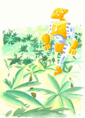
Remember, the flopped line art is printed on the other side and I could see it while I painted. I could have simply put a piece of watercolor paper over the original drawing and, with light shining through both sheets, painted it that way. But everytime I try that I can never keep the two sheets lined up, even with registration marks and tape. By printing the line art on the back of the actual watercolor paper, I made sure it didn't go anywhere. Also, I want the option of doing the line art and coloring at two very different scales. For example, with this technique I could draw my line art huge, shrink it down, and color it with tiny of splashes of paint to create a particular look. In this case, the painted image is just a little smaller than the corresponding line art.
Then I scanned the watercolor, selected the black line art from the original, pasted it on top of the color, matched them up, and cropped. Only the blue sky is colored digitally. The composite picture looks like this: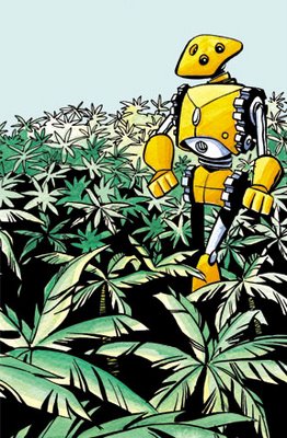
Not my neatest paint job ever, and if I were doing this for real I'd probably do quite a bit of supplemental touch-up and color detailing in Photoshop. But this is basically the look I was going for and I got a few ideas to try next time. All-in-all, a pretty successful experiment.
Color Experiment 1
Friday, August 25, 2006
Labels:
Cartooning,
Publishing
![]()
Subscribe to:
Post Comments (Atom)
0 comments:
Post a Comment