

Yesterday a friend on an Internet newsgroup I frequent jokingly (?) accused me of making my cartoon counterpart in Mom's Cancer look 20 years younger than I actually appear to be in photographs. Ouch. That, along with an interview I recently did with an author writing a book about designing characters for comics, gave me the inspiration and material for today's post. If you don't like it, blame my friend Peter B. Steiger of Cheyenne, Wyoming. Mom's evolution, pre- and post-paste-up.
As I prepared to do Mom's Cancer, I put a lot of thought into what the characters would look like. Making them exact likenesses of my family was not my top priority, which is one reason Editor Charlie and I decided not to publish a photo in the book: as cartoon characters, we're abstract stand-ins for the reader rather than concrete, specific people. Also, we didn't want to pull readers out of the story by giving them a reason to flip back and forth comparing the drawings with reality. But for today's purposes, here's a side-by-side: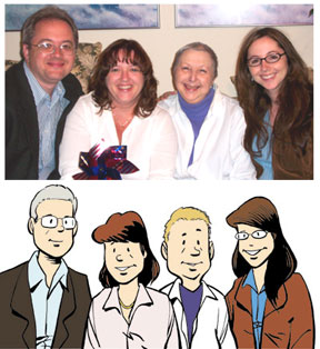
Mom’s Cancer took more than a year to draw and I wanted my characters to be recognizable and consistent from the beginning of the story to the end. I sat down beforehand to make sure I understood the fundamental shapes underlying my characters, could move them around in space and make them work from every angle, etc. I didn't spend a lot of time on it and wasn’t trying to accomplish anything more profound than come up with characters who could do everything I wanted and express every emotion I needed, and that I could stand to draw over and over again.
Mostly, I tried to apply some basic cartooning principles to help the reader subconsciously know my characters before they opened their mouths. In Mom’s Cancer, the characters of Nurse Sis and I are in our forties while Kid Sis is about thirty. Nurse Sis and I therefore have stockier necks, rounder faces, thicker body shapes, and more often than not a bag under an eye. Nurse Sis is a take-charge person who leans forward and leads. My character is more passive and reflective, leaning back. In contrast, Kid Sis is more angular and attractive, with a thinner neck, smaller nose, bigger smile, and better posture.
Of all my characters, Mom is the one that looks least like her real-world counterpart. The Mom character is in her sixties, sick, and tired. Both her head and body are pear-shaped, her posture is poor. Gravity is dragging her down. She has no neck, her eyes are baggy. When she had hair, I drew it with a lot of waves and points that would contrast with her smooth bald head later. Her striped shirt gave me something graphically interesting to play with that stood out against both white and black backgrounds, while her black pants were a negative space I knew I could use effectively once in a while. I was much less interested in creating a character who looked like my mother than one who could help me tell the story.
Despite my initial groundwork, I found that the look of my characters gradually evolved over the course of drawing them dozens of times over several months. That's pretty common for comics characters: Snoopy changed a lot between 1955 and 1995. I actually had to go back and redraw Mom in particular as she became quite unrecognizable. The “Moms” in about the first 20 pages of my book are all paste-up corrections inserted much later because the way I drew her character changed as I grew more comfortable with it and demanded more of it.
I consider that design evolution an interesting failure on my part. If I had put a little more thought into what I expected of the character at the start, I might have been able to design her to hold up better in the long run.
And though I wasn't necessarily aiming for photorealistic accuracy, at least I was honest about my gray hair.
0 comments:
Post a Comment